C:\2010S\IPADSOFT.TXT
2010
iPad: More Room, Different Rules
The iPad's 2010 software combined a larger touch interface with a carefully bounded application lifecycle.
A list and the thing selected from that list are natural companions. On a small phone, they often take turns occupying the screen. On a larger display, making them take turns begins to look like a policy rather than a necessity.
The original iPad’s software had room to reconsider that policy. Its contribution wasn’t simply to enlarge icons. The extra space could preserve context while someone read a message, selected a photograph, or edited a document. A finger still had to find the controls, and the application still needed to behave sensibly when it lost the user’s attention.
Apple announced the iPad on January 27, 2010. The US Wi-Fi model became available on April 3, a date specified in a subsequent announcement rather than the original late-March plan. This article concerns the applications and operating-system contract around that launch, followed by the November update Apple advertised as iOS 4.2.12
The combination matters. The spring interface supplied a larger working surface. The autumn lifecycle changes let people move among applications under rules that differed from an unrestricted desktop. More room on the screen didn’t imply unlimited room for background work.
Compatibility gets the application through the door
Apple’s launch announcement promised compatibility with almost all existing iPhone and iPod touch applications. It also announced universal applications and an SDK with a Mac-based simulator. Those were migration tools for developers with an existing product, rather than proof that a phone layout was ideal on a tablet.1
Compatibility answers one question: can the application run? Interface design answers another: does it use the available space well? A document that appears on a larger sheet hasn’t automatically acquired better organization.
Imagine an invented recipe application. On a phone it shows a recipe list, then navigates to the selected recipe. Returning to the list means leaving the details. On a tablet, the list might remain beside the recipe, allowing the reader to compare entries without continually retracing that navigation.
The underlying information hasn’t changed. The visible relationship has. That can save the user from reconstructing context after every tap.
The distinction also prevents a familiar historical shortcut. Apple marketed productivity applications, including Pages, Numbers, and Keynote, as part of the launch story. Their presence establishes an ambition to make and edit things; it doesn’t establish that every desktop workflow transferred intact.1
A presentation author might care about arranging objects. A spreadsheet author might care about selecting ranges. Those tasks need deliberate touch interaction, not merely a desktop menu rendered at a larger size.
Keep context visible, reveal choices briefly
The May 2010 iPad Human Interface Guidelines describe two additions in iPhone OS 3.2: split views and popovers. A split view contains related panes. A popover reveals temporary information or controls without requiring the application to replace its whole main view.3
In our recipe example, the left pane contains titles and the right pane contains the selected instructions. A temporary portion selector might appear near the control that opens it. Once the choice is made, the main recipe remains the place where work happens.
There is a small but useful discipline here. A temporary control shouldn’t become a second permanent document unless its task requires that. Keeping everything visible can become clutter just as easily as hiding everything can become navigation work.
Orientation supplies another constraint. The period guidelines discuss using a popover for the left pane’s contents in portrait orientation. The same relationship can be presented differently when the geometry changes.3
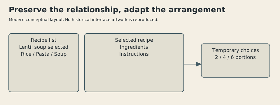
Original explanatory illustration, 2026. Invented recipe layout showing persistent context and temporary choices; not an iPad screenshot or reproduction of Apple’s interface.
The important object to preserve is the selection, rather than the exact arrangement of rectangles. If the reader is viewing lentil soup, turning the device should continue to mean lentil soup. A layout change that forgets the selection has mistaken the container for the contents.
That principle extends beyond tablets. A responsive interface needs an information model stable enough to survive rearrangement. Screen dimensions can change much more quickly than a person’s task.
A small geometry exercise
Touch interfaces need space around actions. The 2010 guidelines specify a minimum 44-by-44-pixel hit target for toolbar items. That is a period recommendation, quoted here using its original units; it isn’t a universal claim about every screen’s physical pixel density.3
For an original teaching exercise, give our invented toolbar 600 layout units of width. Put a 44-unit target around each action and leave 12 units between neighboring targets. Ten actions require:
Eleven require:
Under those invented assumptions, ten fit and eleven don’t. A control with a small drawn symbol can still occupy a larger touch target. The visible picture and the selectable area needn’t be identical.
The calculation isn’t an iPad hardware measurement. It deliberately ignores outer margins, labels, orientation, and localization. Its job is to show why shrinking a glyph doesn’t necessarily solve crowding.
Suppose the eleventh action is rarely used. A temporary panel could hold it along with related options. That introduces one more tap, but may reduce mistakes among the common actions. If the eleventh action is the one people use constantly, the same decision becomes irritating.
This is why a platform guideline can’t design the product by itself. It supplies constraints and conventions. The application author still has to decide which actions deserve immediate access.
A toolbar can satisfy its dimensions and remain baffling. Arithmetic is more cooperative than icon interpretation.
November changes what leaving means
On November 22, Apple announced the iPad update under the name iOS 4.2. Its listed additions included multitasking, folders, a unified inbox, AirPlay, and AirPrint. The announcement ties printing to supporting printers; it doesn’t promise that every existing printer suddenly understands the tablet.4
The update’s multitasking promise deserves a more precise explanation than “several apps run.” Apple’s June 2010 programming guide describes active, inactive, background, suspended, and not-running states on supported iOS 4 devices. Suspension retains an application’s memory state while stopping its code execution.5
That makes a quick return possible without granting every application continuous processor time. It also creates an important distinction between being remembered and being busy.
Consider an invented reading application. It stores the selected book and a location within the text. When the reader switches to another application, the reading app saves enough information to reopen that location. It may subsequently remain suspended in memory, or it may be removed under memory pressure.
From the reader’s perspective, either route should return to the same passage. From the programmer’s perspective, resuming retained memory and rebuilding from saved state are different operations.
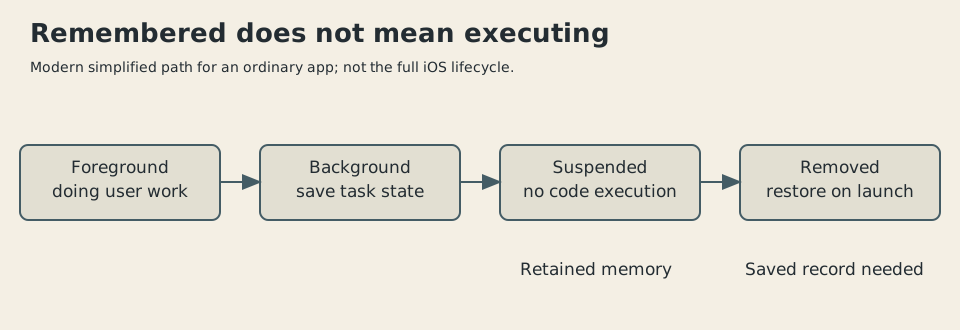
Original illustration, 2026. Simplified ordinary-app path informed by the 2010 programming guide. Some authorized background work follows different paths; this isn’t the complete iOS state diagram.
The guide warns that a suspended application can be purged without another notification. Saving only when told of final termination is therefore an unreliable plan.5
Our reading example is deliberately simple. An editor may also need to preserve an unfinished change, the selected object, and the relationship between visible text and the saved document. A shopping application may have to verify that an old price remains valid. Returning to the same-looking page doesn’t make its contents current.
State preservation is its own mechanism
Here is the recipe version of that problem. We select recipe 17, choose six portions, and scroll to instruction 4. A small saved record could contain three values:
recipe_id: 17
portions: 6
instruction_id: 4
These identifiers are invented, not an Apple storage format. Restoring the record means loading recipe 17, applying the portion choice, and locating instruction 4. It doesn’t mean taking a photograph of the old screen and hoping it remains useful.
Now imagine the recipe data has changed while the application was absent. Instruction 4 might have been deleted. The restoration code needs a fallback, perhaps opening the recipe near the beginning. A saved reference needs interpretation against the current data.
This is a reason to save meaning rather than raw coordinates. A vertical offset can point somewhere different after text reflows. A stable instruction identifier can survive a different display width, provided the data model preserves it.
It also explains why seamless switching is work performed by both platform and application. The operating system provides transitions and opportunities to save. The application decides what constitutes the user’s unfinished task.
Background work came with a purpose
The period programming guide allows particular forms of continued work, including audio playback, and discusses requesting time to finish tasks. These are defined exceptions to ordinary suspension, rather than an invitation to execute indefinitely just because an app once opened.5
A music player and a recipe reader have different reasons to remain active. Silencing music whenever the user opens the recipe would defeat a reasonable task. Keeping the recipe reader’s animations running out of sight would spend resources without improving the meal.
The platform’s bounded contract makes those purposes matter. It can improve responsiveness and resource use, while limiting workflows that expect arbitrary long-running background activity. That is a real tradeoff, even when the application switch itself looks smooth.
The 2010 iPad therefore belongs in software history for the agreement it proposed between interface and execution. The foreground offered a generous touch surface. The background followed a more constrained model, with application authors responsible for preserving continuity.
Later iPad windowing systems and different multitasking interfaces belong to later releases. They should not be silently attached to this first-year arrangement.
What I admire in the early model is the attention to context: keep related material visible when space permits, keep temporary decisions temporary, and retain the user’s place when the application leaves the screen. What remains difficult is deciding which context matters.
The tablet can remember a recipe and the step you were reading. It still can’t tell whether you’ve already added the salt.
Sources
Footnotes
-
Apple, “Apple Launches iPad”, January 27, 2010. Software ambition, existing-app compatibility, universal applications, SDK, and initial schedule; marketing superlatives aren’t adopted as factual judgments. ↩ ↩2 ↩3
-
Apple, “iPad Available in US on April 3”, March 5, 2010. Later specified US Wi-Fi availability, distinct from announcement and international scheduling. ↩
-
Apple, iPad Human Interface Guidelines, May 7, 2010, preserved manual text, pp. 41–45. Toolbar targets, popovers, split views, and orientation. Apple’s primary document is hosted by a third-party preservation site; its images aren’t reproduced. ↩ ↩2 ↩3
-
Apple, “Apple’s iOS 4.2 Available Today for iPad, iPhone & iPod touch”, November 22, 2010. Uses Apple’s advertised release name; doesn’t assert a precise installed build number. ↩
-
Apple, iOS Application Programming Guide, June 30, 2010, preserved at Iowa State, pp. 29–39 and 63–72. Read state/transition and background-work sections. Predates the iPad’s autumn update; documents the iOS 4 contract, not April iPad multitasking. ↩ ↩2 ↩3